Office Design / Executive Leadership
Executive Office Design 2026: What Luxury Workplace Aesthetics Actually Signal
By Alex

# Executive Office Design 2026: What Luxury Workplace Aesthetics Actually Signal
Walk into any executive office and you'll form a judgment within five seconds. The research on thin-slice perception is unambiguous: people make accurate assessments of competence, status, and trustworthiness from brief exposure to environments. Your office is being read before you say a word.
For premium organizations, this is not about vanity. It's about alignment. A private equity firm that manages nine-figure funds cannot operate from an office furnished like a dental insurance call center. A law firm positioning itself for Fortune 500 clients cannot host those clients in rooms that look like a coworking space. The dissonance undermines credibility.
Here is what each element of executive office design signals — and how to make those signals intentional.
## The Desk: Authority Configuration
The desk is the single largest object in any office. It commands attention by sheer mass. What it says depends on what it's made of and how it's positioned.
**The monolithic executive desk** — solid wood, substantial proportions, positioned facing the door — signals hierarchy and permanence. It says: decisions are made here, and they are not unmade easily. This configuration works for law, finance, and any industry where clients pay for judgment and stability.
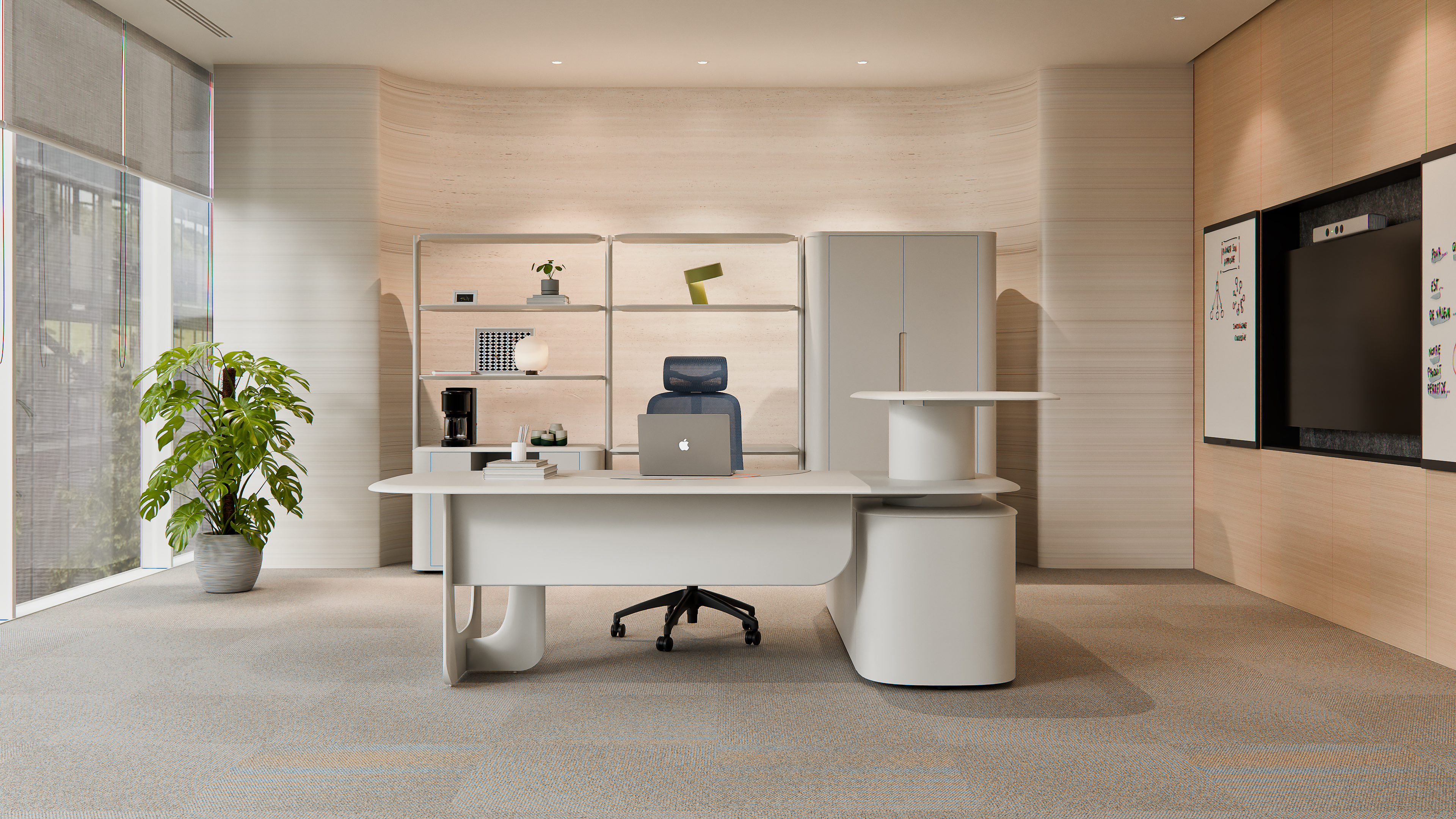
**The floating desk** — thinner profile, mixed materials (wood with metal or stone), positioned at an angle or facing a window — signals modernity and accessibility. It says: this is a place for collaboration, not command. Technology and creative firms favor this configuration for good reason: it lowers the perceived power distance between executive and team.
**The deskless office** — meeting table only, or lounge seating — signals extreme accessibility and flat hierarchy. It works only when the executive's authority is already so well-established that it needs no physical reinforcement. Attempting this as a newly promoted VP reads as insecurity, not approachability.
Material choice compounds these signals. Walnut and mahogany communicate heritage and substance. White oak and maple communicate clarity and contemporary values. Glass communicates transparency — but also fingerprints, glare, and the constant anxiety of smudging.
**Stone surfaces** — marble, quartzite, or granite — have entered the executive office from luxury residential design. A stone desk or credenza top signals permanence at a geological scale. It also signals that the organization is willing to spend on things that have no functional justification beyond their presence.
## Seating: The Hierarchy of Comfort
Executive offices contain two categories of seating, and they send different messages.
**Visitor seating** should be comfortable enough to put guests at ease but not so comfortable that they settle in. The classic solution is a mid-back guest chair in leather or wool — substantial materials that read as respectful, with proportions that don't challenge the principal's chair. A pair of guest chairs facing the desk is the standard configuration; a small meeting table with four chairs signals a more collaborative leadership style.
**The principal's chair** is the throne, whether anyone admits it or not. It should be visibly distinct from visitor seating — taller back, more substantial frame, premium material. The ergonomic argument (the person who sits here eight hours a day needs more support) conveniently aligns with the status argument (the person who sits here runs things).
The mistake executives most often make is choosing a chair that's imposing to sit in but punishing to work in. A high-back leather chair with no lumbar adjustment and a fixed recline is a prop, not a tool. It communicates status for the thirty seconds a visitor sees it and compromises the executive's body for the eight hours nobody sees.
## Materials That Carry Meaning
Every material in an executive office is a word in a sentence. The sentence should be coherent.
### Wood
**Wood** is the most information-dense material choice. The species matters:
- **Walnut** — the default for American executive spaces since the mid-20th century. Dark, rich, traditional without being stuffy. It says "established."
- **White oak** — lighter, more contemporary. Popular in tech and creative industries. It says "modern but serious."
- **Cherry** — warm, red-toned, associated with craftsmanship. It says "detail-oriented."
- **Ebony or wenge** — nearly black, dramatic. It says "power." Used sparingly; an entire office in dark wood reads as intimidating rather than impressive.
### Leather
**Leather** has a hierarchy of its own:
- **Full-grain** — the entire hide, sanded only to remove hair. Visible grain, natural markings, patina development over decades. This is the only leather that ages beautifully.
- **Top-grain** — the surface layer sanded to remove imperfections, then finished. More uniform, less character, still durable.
- **Corrected-grain** — heavily sanded and embossed with an artificial grain pattern. Reads as leather but doesn't behave like it over time.
- **Bonded leather** — leather dust glued to a fabric backing. Avoid in any context where quality matters. It peels, and peeling leather signals decay.
### Metal
**Metal** finishes complete the material vocabulary:
- **Polished aluminum** — clean, modern, technical. The standard for contemporary executive furniture.
- **Brushed stainless steel** — slightly warmer than polished, hides fingerprints. The pragmatic choice.
- **Polished brass or bronze** — warm, traditional, associated with heritage and permanence. Used extensively in law and finance.
- **Matte black** — architectural, dramatic. Works best as an accent rather than a dominant finish.
- **Polished chrome** — reflective and attention-grabbing. Reads as decorative rather than authoritative. Use sparingly.
### Stone and Glass
**Stone** — marble, quartzite, travertine, or granite — adds mass and permanence that wood alone cannot achieve. A stone conference table or credenza top is an architectural statement: this organization intends to be here for a very long time.
**Glass** — tempered, often back-painted or tinted — adds lightness and transparency. A glass desk reads as modern and open. It also reads as high-maintenance. The tradeoff should be intentional.
## The Conference Table: Decision Architecture
The shape of the conference table determines the shape of the conversation.
**Rectangular** — hierarchical. The head of the table is unambiguous. This works for decision-making meetings where authority needs to be clear. It works less well for brainstorming or collaboration.
**Boat-shaped or racetrack** — softens hierarchy without eliminating it. The curve makes eye contact easier between participants at the sides while maintaining a clear head position.
**Round** — egalitarian by design. No head, no foot, no corners. Round tables create different conversations than rectangular ones. Research on negotiation outcomes shows that round-table configurations produce more equitable agreements — which may or may not be what you want.
**Modular** — multiple smaller tables that can be arranged and rearranged. Maximum flexibility, minimum formality. This signals adaptability and has become the default for organizations that see themselves as agile.
The material of a conference table should be durable enough to withstand coffee cups, laptop chargers, and leaning elbows for a decade. Veneer over engineered wood with a protective finish is the practical standard. Solid wood is an investment in permanence. Stone or glass tops make a stronger statement but require more maintenance.
## Lighting: The Invisible Signal
Lighting is the most overlooked element of executive office design — and the one visitors notice most, even if they can't articulate why.
**Natural light** is non-negotiable. An office with windows signals access to resources. An office without windows signals the opposite, regardless of title. If your organization puts executives in interior offices and gives windows to junior staff, that's a design statement about values. Make sure it's the statement you intend.
**Ambient lighting** — recessed ceiling fixtures, cove lighting, or indirect fixtures — should provide even illumination at 300-500 lux. This is the baseline.
**Task lighting** — a desk lamp or adjustable fixture — should provide 500-800 lux on the work surface. This is where most of the actual design character lives. A brass banker's lamp signals tradition. An articulated aluminum task light signals precision and modernity. A sculptural fixture signals design sensibility.
**Accent lighting** — spotlights on art, bookshelves, or architectural features — is what separates a designed space from a furnished room. It creates visual hierarchy and directs attention. If you have something worth looking at (art, books, a view), light it.
The color temperature should be consistent across all sources. Mixing 2700K and 4000K light in the same room reads as carelessness. Warm white (2700K-3000K) is the standard for executive spaces; it flatters skin tones and makes wood and leather look richer. Cooler temperatures (3500K+) read as clinical or industrial — appropriate for a trading floor, not an executive office.
## Art and Objects: What You Choose to Display
Empty walls signal either that nobody has gotten around to furnishing this office, or that the occupant doesn't plan to stay. Neither is a message most executives want to send.
Art selection is personal, but it communicates:
- **Original work** — signals investment in culture and support for artists
- **Limited edition prints** — signals connoisseurship within budget constraints
- **Company mission statements, framed** — signals that the occupant believes in the organization (or wants to be seen believing in it)
- **Diplomas and credentials** — signals professional legitimacy; common in law, medicine, and consulting
- **Industry awards** — signals achievement and external validation
- **Family photos** — signals personal warmth and work-life integration
- **Empty walls** — signals transience
The rule is simple: everything visible should be something you would be comfortable explaining to a visitor who asked about it. If an object is there because someone from facilities hung it five years ago and you've never noticed it, remove it. Intentional blank space is better than unintentional clutter.
## The Five-Second Audit
Stand in your office doorway. Without rationalizing, notice what you feel. Then walk through each element — desk, seating, materials, lighting, art — and ask: is this signal intentional?
The goal is not to look like a magazine spread. It's to ensure that the physical environment tells the same story the organization tells about itself. When those stories align, visitors trust what they're experiencing. When they clash, something feels off, even if nobody can name it.
That feeling of "off" is expensive. It erodes confidence before the first handshake.
Walk into any executive office and you'll form a judgment within five seconds. The research on thin-slice perception is unambiguous: people make accurate assessments of competence, status, and trustworthiness from brief exposure to environments. Your office is being read before you say a word.
For premium organizations, this is not about vanity. It's about alignment. A private equity firm that manages nine-figure funds cannot operate from an office furnished like a dental insurance call center. A law firm positioning itself for Fortune 500 clients cannot host those clients in rooms that look like a coworking space. The dissonance undermines credibility.
Here is what each element of executive office design signals — and how to make those signals intentional.
## The Desk: Authority Configuration
The desk is the single largest object in any office. It commands attention by sheer mass. What it says depends on what it's made of and how it's positioned.
**The monolithic executive desk** — solid wood, substantial proportions, positioned facing the door — signals hierarchy and permanence. It says: decisions are made here, and they are not unmade easily. This configuration works for law, finance, and any industry where clients pay for judgment and stability.
**The floating desk** — thinner profile, mixed materials (wood with metal or stone), positioned at an angle or facing a window — signals modernity and accessibility. It says: this is a place for collaboration, not command. Technology and creative firms favor this configuration for good reason: it lowers the perceived power distance between executive and team.
**The deskless office** — meeting table only, or lounge seating — signals extreme accessibility and flat hierarchy. It works only when the executive's authority is already so well-established that it needs no physical reinforcement. Attempting this as a newly promoted VP reads as insecurity, not approachability.
Material choice compounds these signals. Walnut and mahogany communicate heritage and substance. White oak and maple communicate clarity and contemporary values. Glass communicates transparency — but also fingerprints, glare, and the constant anxiety of smudging.
**Stone surfaces** — marble, quartzite, or granite — have entered the executive office from luxury residential design. A stone desk or credenza top signals permanence at a geological scale. It also signals that the organization is willing to spend on things that have no functional justification beyond their presence.
## Seating: The Hierarchy of Comfort
Executive offices contain two categories of seating, and they send different messages.
**Visitor seating** should be comfortable enough to put guests at ease but not so comfortable that they settle in. The classic solution is a mid-back guest chair in leather or wool — substantial materials that read as respectful, with proportions that don't challenge the principal's chair. A pair of guest chairs facing the desk is the standard configuration; a small meeting table with four chairs signals a more collaborative leadership style.
**The principal's chair** is the throne, whether anyone admits it or not. It should be visibly distinct from visitor seating — taller back, more substantial frame, premium material. The ergonomic argument (the person who sits here eight hours a day needs more support) conveniently aligns with the status argument (the person who sits here runs things).
The mistake executives most often make is choosing a chair that's imposing to sit in but punishing to work in. A high-back leather chair with no lumbar adjustment and a fixed recline is a prop, not a tool. It communicates status for the thirty seconds a visitor sees it and compromises the executive's body for the eight hours nobody sees.
## Materials That Carry Meaning
Every material in an executive office is a word in a sentence. The sentence should be coherent.
### Wood
**Wood** is the most information-dense material choice. The species matters:
- **Walnut** — the default for American executive spaces since the mid-20th century. Dark, rich, traditional without being stuffy. It says "established."
- **White oak** — lighter, more contemporary. Popular in tech and creative industries. It says "modern but serious."
- **Cherry** — warm, red-toned, associated with craftsmanship. It says "detail-oriented."
- **Ebony or wenge** — nearly black, dramatic. It says "power." Used sparingly; an entire office in dark wood reads as intimidating rather than impressive.
### Leather
**Leather** has a hierarchy of its own:
- **Full-grain** — the entire hide, sanded only to remove hair. Visible grain, natural markings, patina development over decades. This is the only leather that ages beautifully.
- **Top-grain** — the surface layer sanded to remove imperfections, then finished. More uniform, less character, still durable.
- **Corrected-grain** — heavily sanded and embossed with an artificial grain pattern. Reads as leather but doesn't behave like it over time.
- **Bonded leather** — leather dust glued to a fabric backing. Avoid in any context where quality matters. It peels, and peeling leather signals decay.
### Metal
**Metal** finishes complete the material vocabulary:
- **Polished aluminum** — clean, modern, technical. The standard for contemporary executive furniture.
- **Brushed stainless steel** — slightly warmer than polished, hides fingerprints. The pragmatic choice.
- **Polished brass or bronze** — warm, traditional, associated with heritage and permanence. Used extensively in law and finance.
- **Matte black** — architectural, dramatic. Works best as an accent rather than a dominant finish.
- **Polished chrome** — reflective and attention-grabbing. Reads as decorative rather than authoritative. Use sparingly.
### Stone and Glass
**Stone** — marble, quartzite, travertine, or granite — adds mass and permanence that wood alone cannot achieve. A stone conference table or credenza top is an architectural statement: this organization intends to be here for a very long time.
**Glass** — tempered, often back-painted or tinted — adds lightness and transparency. A glass desk reads as modern and open. It also reads as high-maintenance. The tradeoff should be intentional.
## The Conference Table: Decision Architecture
The shape of the conference table determines the shape of the conversation.
**Rectangular** — hierarchical. The head of the table is unambiguous. This works for decision-making meetings where authority needs to be clear. It works less well for brainstorming or collaboration.
**Boat-shaped or racetrack** — softens hierarchy without eliminating it. The curve makes eye contact easier between participants at the sides while maintaining a clear head position.
**Round** — egalitarian by design. No head, no foot, no corners. Round tables create different conversations than rectangular ones. Research on negotiation outcomes shows that round-table configurations produce more equitable agreements — which may or may not be what you want.
**Modular** — multiple smaller tables that can be arranged and rearranged. Maximum flexibility, minimum formality. This signals adaptability and has become the default for organizations that see themselves as agile.
The material of a conference table should be durable enough to withstand coffee cups, laptop chargers, and leaning elbows for a decade. Veneer over engineered wood with a protective finish is the practical standard. Solid wood is an investment in permanence. Stone or glass tops make a stronger statement but require more maintenance.
## Lighting: The Invisible Signal
Lighting is the most overlooked element of executive office design — and the one visitors notice most, even if they can't articulate why.
**Natural light** is non-negotiable. An office with windows signals access to resources. An office without windows signals the opposite, regardless of title. If your organization puts executives in interior offices and gives windows to junior staff, that's a design statement about values. Make sure it's the statement you intend.
**Ambient lighting** — recessed ceiling fixtures, cove lighting, or indirect fixtures — should provide even illumination at 300-500 lux. This is the baseline.
**Task lighting** — a desk lamp or adjustable fixture — should provide 500-800 lux on the work surface. This is where most of the actual design character lives. A brass banker's lamp signals tradition. An articulated aluminum task light signals precision and modernity. A sculptural fixture signals design sensibility.
**Accent lighting** — spotlights on art, bookshelves, or architectural features — is what separates a designed space from a furnished room. It creates visual hierarchy and directs attention. If you have something worth looking at (art, books, a view), light it.
The color temperature should be consistent across all sources. Mixing 2700K and 4000K light in the same room reads as carelessness. Warm white (2700K-3000K) is the standard for executive spaces; it flatters skin tones and makes wood and leather look richer. Cooler temperatures (3500K+) read as clinical or industrial — appropriate for a trading floor, not an executive office.
## Art and Objects: What You Choose to Display
Empty walls signal either that nobody has gotten around to furnishing this office, or that the occupant doesn't plan to stay. Neither is a message most executives want to send.
Art selection is personal, but it communicates:
- **Original work** — signals investment in culture and support for artists
- **Limited edition prints** — signals connoisseurship within budget constraints
- **Company mission statements, framed** — signals that the occupant believes in the organization (or wants to be seen believing in it)
- **Diplomas and credentials** — signals professional legitimacy; common in law, medicine, and consulting
- **Industry awards** — signals achievement and external validation
- **Family photos** — signals personal warmth and work-life integration
- **Empty walls** — signals transience
The rule is simple: everything visible should be something you would be comfortable explaining to a visitor who asked about it. If an object is there because someone from facilities hung it five years ago and you've never noticed it, remove it. Intentional blank space is better than unintentional clutter.
## The Five-Second Audit
Stand in your office doorway. Without rationalizing, notice what you feel. Then walk through each element — desk, seating, materials, lighting, art — and ask: is this signal intentional?
The goal is not to look like a magazine spread. It's to ensure that the physical environment tells the same story the organization tells about itself. When those stories align, visitors trust what they're experiencing. When they clash, something feels off, even if nobody can name it.
That feeling of "off" is expensive. It erodes confidence before the first handshake.